
Allianz:
Raising our internal communications game on the Path to Paris
As world number one, Allianz are used to setting the pace in the world of insurance. Having worked closely together in partnership as a retained agency for over a decade, we’ve developed an innate understanding of their global brand.
So, when a familiar face reached out with an exciting new challenge to raise money for some good causes while uniting a distributed workforce and inspiring teams to get behind the Paris Olympics and Paralympic games
– we knew we were on to a winner.
The brief
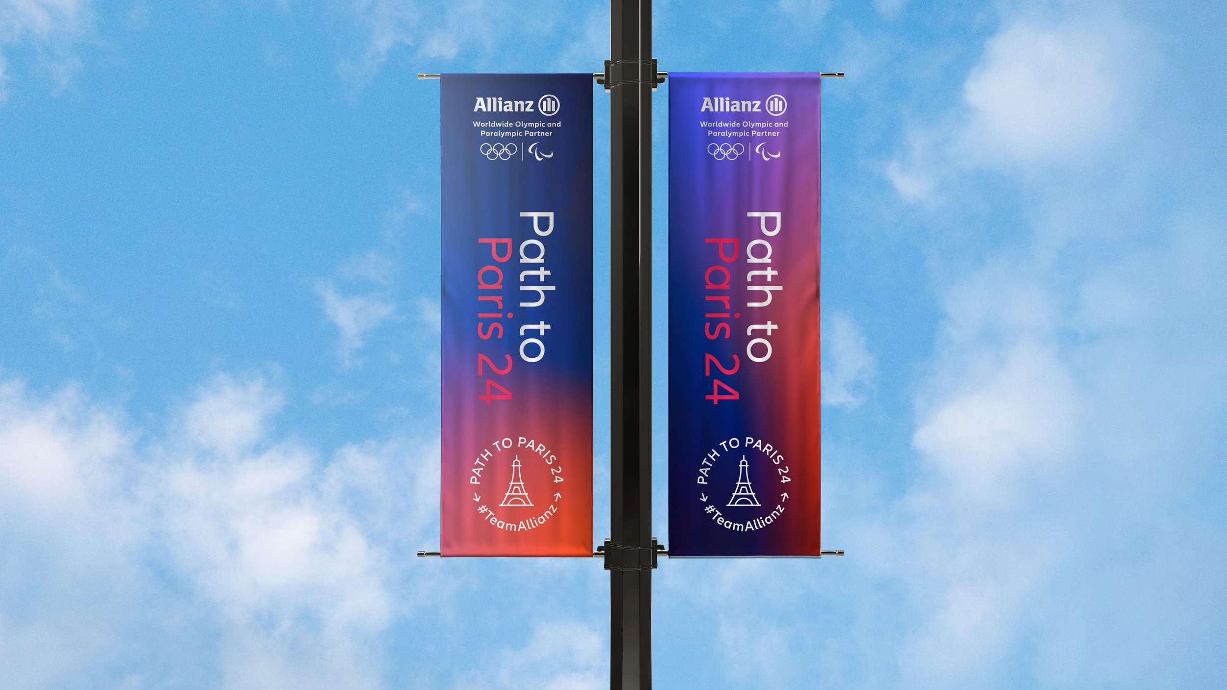
The Path to Paris is an ambitious employee engagement campaign aiming to raise £100,000 for Allianz Charities. By bringing colleagues across the UK closer together in the build-up to the 2024 games with a series of localised fundraising events – Allianz are passing an Olympic torch from the top to the bottom of the UK. Building excitement and driving employee engagement, branch by branch.
Our job? To create localised employee engagement toolkits that enable branches to inspire their teams to take part – containing everything from email footers, screensavers and digital invitations to t-shirts, posters, medals, mascots and more. Not forgetting their very own Allianz Olympic torch.


Bespoke suite of icons for regional offices


“They look great – so thank you again for your hard work, I know it wasn’t easy”


On your marks. Get set. Engage.
With the brief landing in April – just a month ahead of the first event in June – we had to come out of the blocks fast.
As a campaign, Path to Paris really needed to stand out. Thankfully, our instinctive feel for the brand guidelines meant we knew just how far we could push things. No easy task when you’re working with such a strong, instantly recognisable and globally renowned brand identity – as well as the tightly regulated Olympics branding.
Consistency would be key in this delicate juggling act. But we still had room to get creative. Crafting bespoke icons for each of the individual branches from scratch allowed us to make the campaign assets feel truly targeted. While an on-brand red, white and blue palette and dynamic, localised imagery gave us the punchy visuals we needed to cut-through a busy internal comms calendar.