


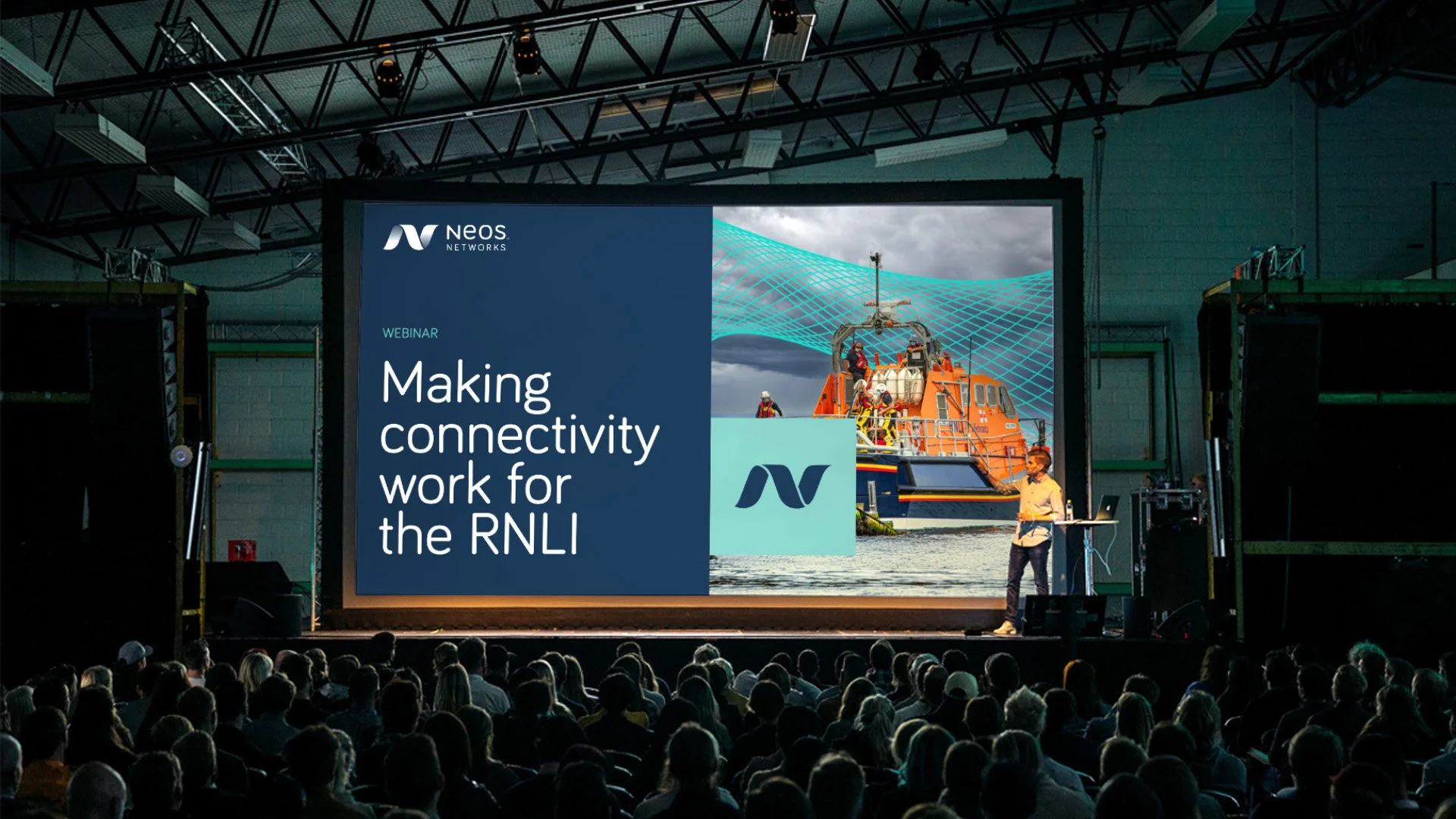
Making Connectivity Work
Neos Networks is one of the UK’s leading business connectivity providers, powering thousands of critical connections across the country. With a strong, cohesive brand already in place, the Neos team approached us to help evolve their visual system – making it more adaptable, more digital-friendly, and easier to apply consistently across campaigns and service areas. From early discovery to final rollout, we worked together to create a refreshed identity that builds on their strengths and brings greater clarity and confidence to every touchpoint.
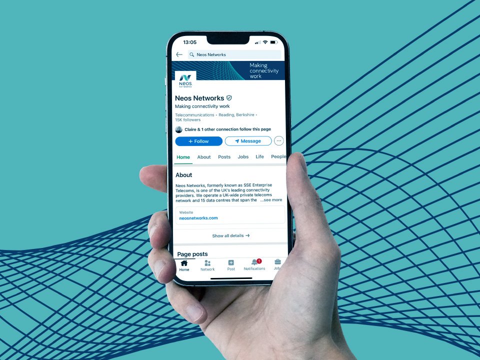
While the existing brand was working well, it was beginning to show its limits – particularly in digital environments. Campaigns were starting to blend into one another, some colours appeared dull on screen, and service areas lacked clear visual separation. The gradient line devices, though distinctive, were proving restrictive and difficult to adapt across formats. The image library was also limited, making it harder for internal teams to respond at pace.
After a series of discovery sessions with stakeholders, we developed three creative directions: a subtle step forward, a balanced refresh, and a full rework. All three routes were well received, and the business opted for a refined approach – drawing on elements from the complete overhaul while keeping the recognisable strengths of the original identity.
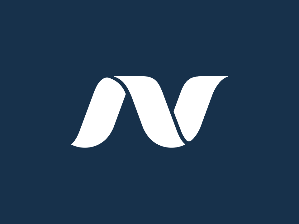
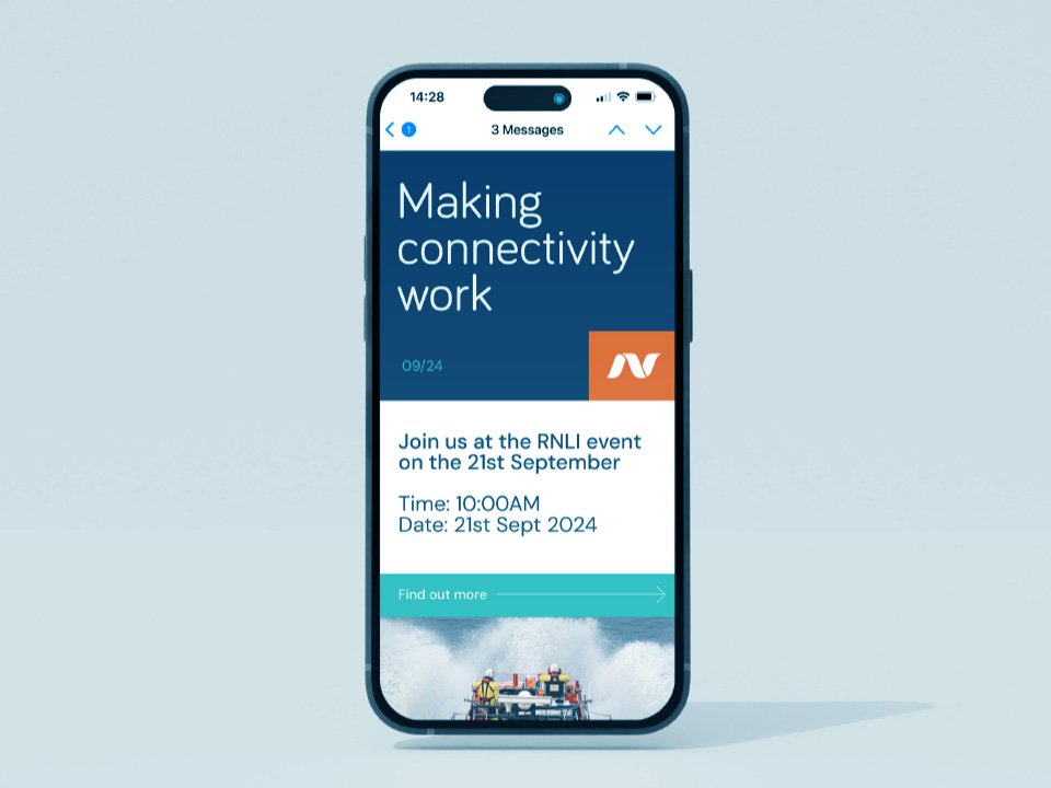
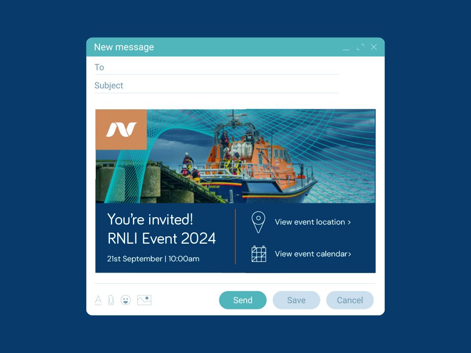
As part of the refresh, we introduced a bold new “N” device – drawn from the Neos Networks logo – to act as a distinctive visual mark without changing the core brand.
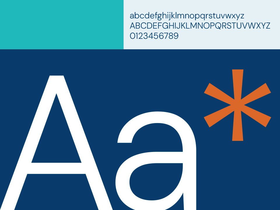
We also developed new line devices that retained the essence of the Neos Networks identity but were simpler, more flexible, and easier to use. The grid system was enhanced to bring stronger visual structure, particularly across digital applications, and the colour palette was refreshed to improve on-screen performance and clarity.
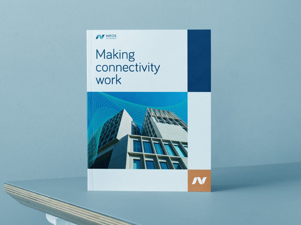
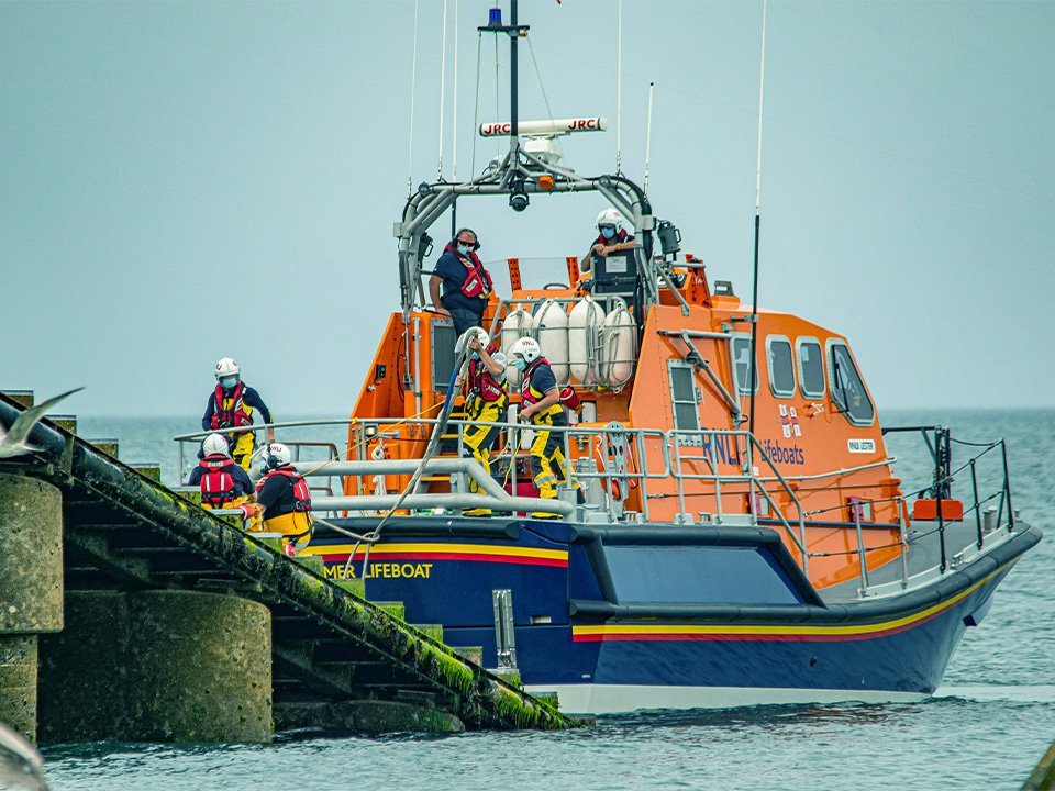
A new, more versatile image library was also curated using Getty Images – giving internal teams a richer, more relevant set of visuals to draw from across campaigns and communications.
The result is a sharper, more connected identity that gives Neos Networks the tools to express who they are and where they’re heading – with templates, campaigns, and a new website on the way.

Katie Ireland, Marketing Director, Neos Networks
“We wanted to evolve our brand without starting from scratch. SandisonPay got it straight away – they built on our strengths, challenged us in the right places, and delivered a refresh that’s already making a difference across the business.”


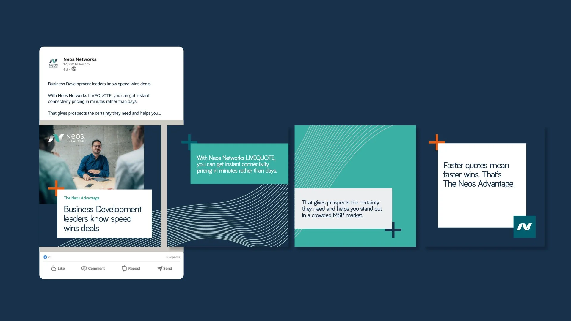
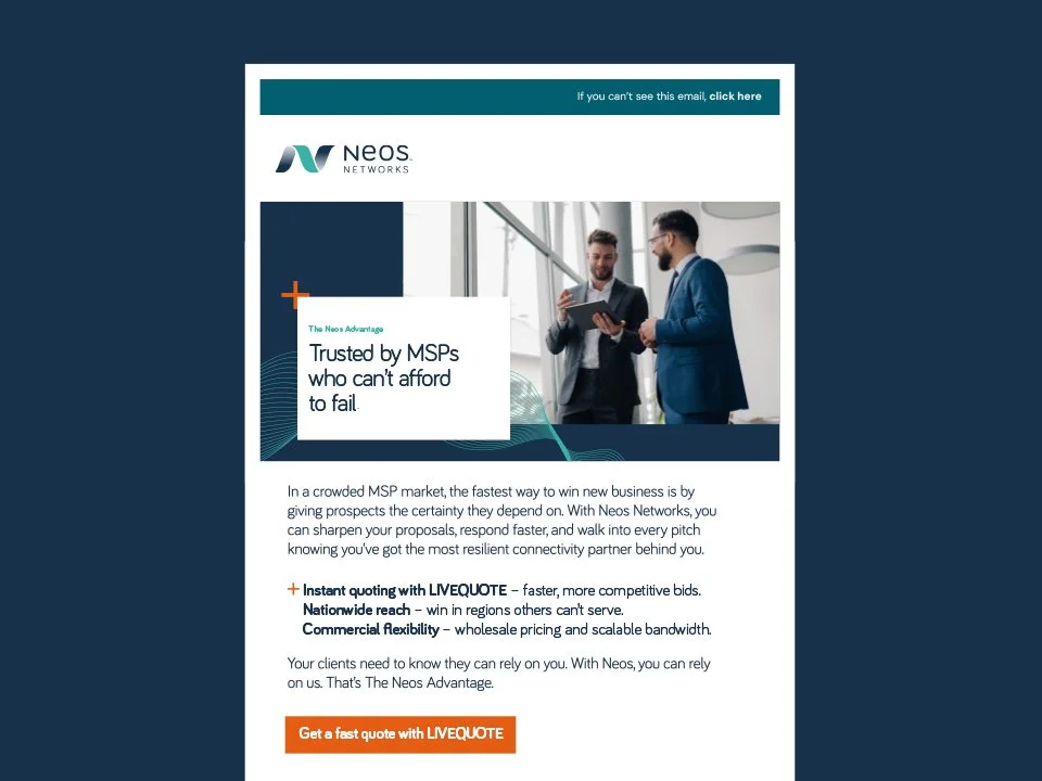
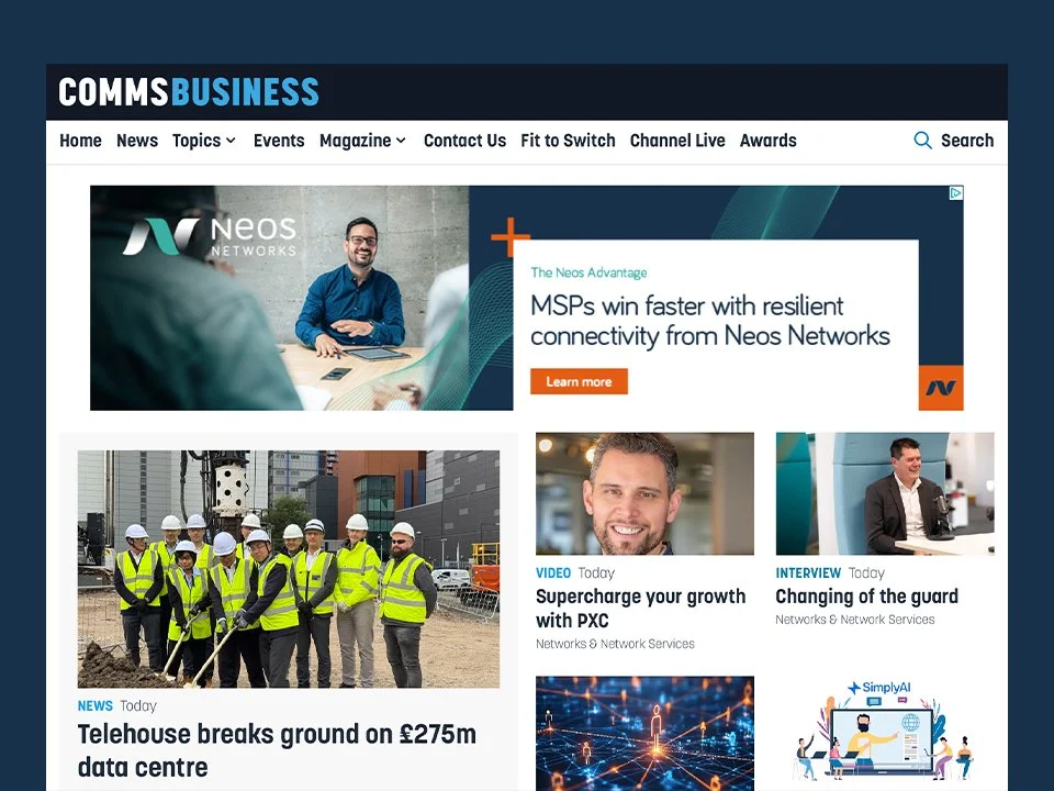
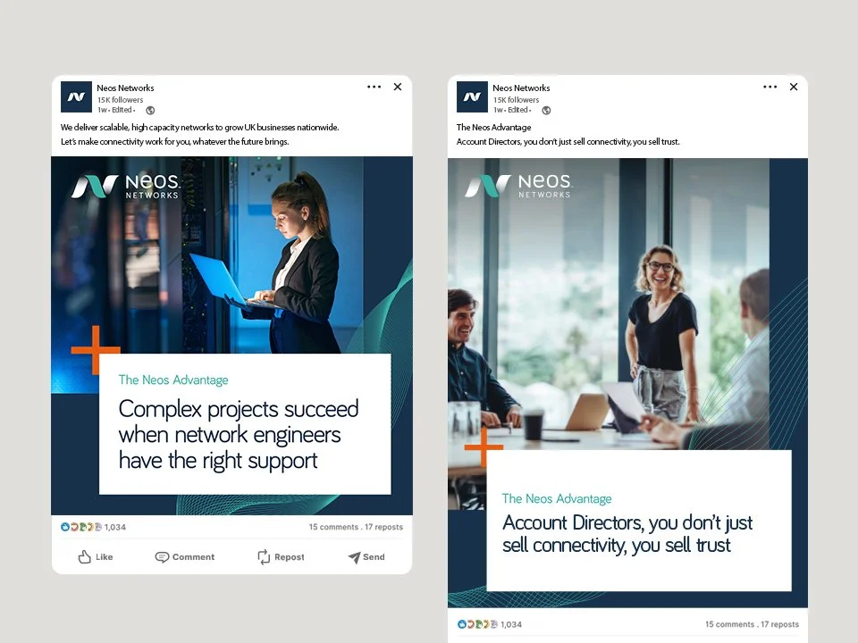
The Neos Advantage
Following a comprehensive brand refresh for Neos Networks in 2025, we partnered with their team to activate the new identity through a targeted MSP campaign.
With a brief to position Neos as the MSP connectivity partner of choice, we developed the campaign platform, The Neos Advantage. After exploring several creative routes, this was the direction selected. It gave the campaign a clear and differentiated theme that felt confident within the refreshed brand system.
Targeting three distinct MSP personas, the campaign uses proof-led storytelling and clear value messaging to highlight Neos’ resilience, responsiveness and flexibility, with the ultimate goal of generating MQLs.
Working firmly within the Neos brand guidelines, we also introduced a simple visual hook, a + symbol to represent The Neos Advantage. It helped the campaign stand out while remaining fully on brand.


Claire Pay, Creative Director, SandisonPay